Image by Getty Images via @daylife
This post might as well be titled – the genius of Verizon or how I overcame ingrained user behavior to save $60/month.
There is a lot of talk, books, and blogs about how properly designed user experience is a key to doing more business on the web, and in real life. But what if the pundits are wrong? What if you have a business that needs to interact with customers on the Web, but where making transactions easy means losing money?
What if you knew everything there is to know about user experience and customer service? What if you turned that knowledge inside out to create an impenetrable online maze? What if you coldly calculated what kind of transactions you want to make easy, and which you want to discourage? You be just doing your job, right? Following orders, as it were. And you might be working for Verizon.
Once I realized that Verizon does not actually want you to make changes their whole website started making sense. It is not ineptitude that allows you to pay the bill right away, but requires an expiring PIN delivered by mail or a phone call to a Verizon home phone line to change your channel choices. It is brilliant and deliberate design.
Verizon’s problem is that whenever people actually look at their bills, they immediately realize that they do not need 285 channels and a 50GB backup bundles with teaser rates that expired 6 months ago. So their formal UX design challenge is to have all of the functionality expected of a customer-facing website, but have it sort of off.Â
For example – you would think that having “See More” option that does not lead anywhere would be a bad design choice. Not so.


It does not show me any options for additional movie channels but that is OK for Verizon, because they understand something far more important – bounce rate is their friend.
While most sites want to keep their users for as long as possible, Verizon understands that there is only so much time an average person will spend, at a go, trying to make sense of their subscriptions and options. So if I get frustrated and leave before making a change – that’s OK. Chances are that I was going to downgrade my service or cancel an option, so if a page takes 20 or 30 seconds to load – that’s OK. In this game, Â bounce rate is their friend.
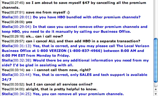
Still, I persevered. I got the PIN. I wanted to cancel some channels but keep some others. Finally, I asked their live chat support:

I think the support tried to get me to bounce – I need to call an office from 9-5 M-F to change  my choices? I am already committed to change, so I would rather feel righteous for saving more money (and watching less TV) than to stop now. As a result – all premium channels cancelled.
Epilogue:
Has Verizon lost its battle in keeping me away from changes? Alas, no. they simply ignored my request. Maybe I did not press some button correctly, maybe I did not wait long enough, but when I came back 18 hours later, I will had the channel subscriptions unchanged from before. I submitted the changes again, perhaps they will stick this time.


