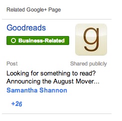
Related Google+ Page Widget
I am always on the lookout for a smart UX decision. Today’s feature is a relatively recently added “Related Google+ Page” feature on gmail.
– What is it?
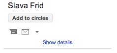
It is small widget in the upper right corner which replaces the person’s widget when an email is sent from a corporate account instead of a personal email.
– Why I like this?
It is actually serving a useful purpose without being overly annoying and in your face. Located in the upper right corner of the open email and as such does not interfere with the message itself. It does not require me to dismiss or otherwise interrupt my flow but helps draw attention to what I may not not – that there is a public google+ page for this entity.
– Why is this good for Google?
Lots of people follow their favorite companies on Facebook, but few user would be going on Google+ looking for yet another place to see these companies. This widget allows Google to leverage the enormous reach of GMail to promote its other property without being overly annoying.
– Extra benefit for the user
If you are already following this organization you will see that it is in one or more of your circles, possibly giving you a reminder of a prior relationship.
Conclusion:
Google needs all the help it can get to compete with Facebook and grow Google+. They are doing a good job leveraging GMail and other Google properties in this war, and GMail users are already used to, theoretically, to their emails being processed in order to target ads.
From the User Experience design perspective this is a nice little feature that adds a little value without asking anything from the user upfront.


